Browse & search docs
Theming
Every surface in LoreGUI is a semantic token, so the whole app can re-skin instantly. Ship a dark theme for late nights and a light one for the studio, from the same controls.
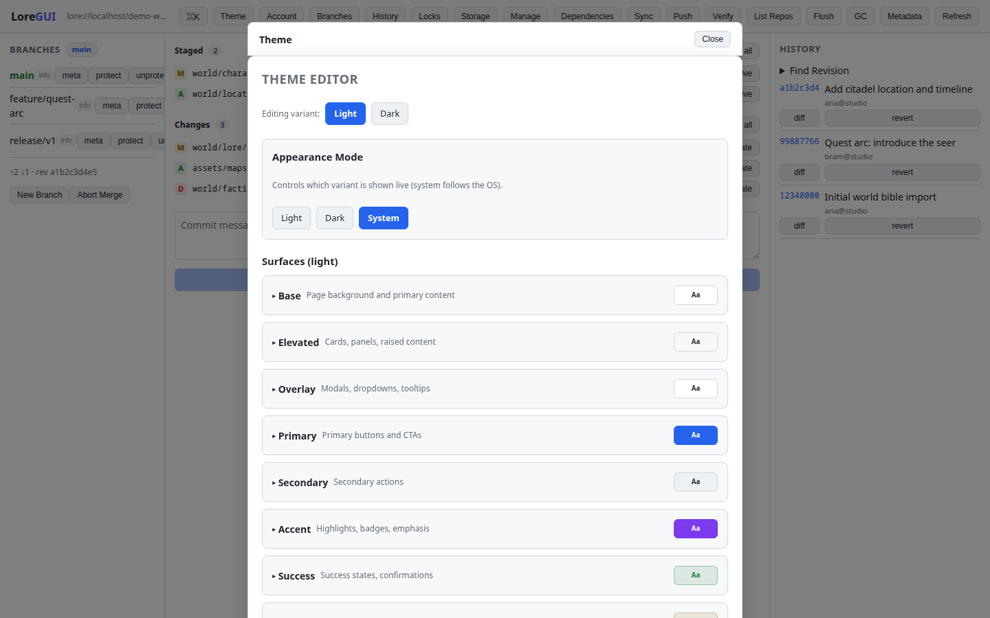
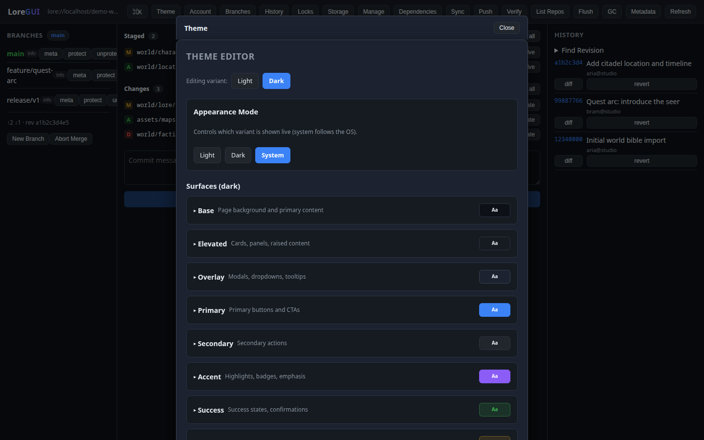
The semantic surface model
UI never hardcodes a color, font, or shadow — it consumes theme tokens, written as CSS custom properties on :root. The model is 12 surfaces, each with 7 slots:
--surface-<name>-bg
--surface-<name>-text
--surface-<name>-text-secondary
--surface-<name>-border
--surface-<name>-hover
--surface-<name>-active
--surface-<name>-shadow
The 12 surfaces and what they're for:
| Surface | Used for |
| --- | --- |
| base | page background, primary content, body text |
| elevated | cards, panels, raised content |
| overlay | modals, dropdowns, the command palette, tooltips |
| primary | primary buttons and calls to action |
| secondary | secondary / neutral action buttons |
| accent | highlights, badges, emphasis |
| success · warning · error · info | semantic status only |
| navigation | top bar, sidebars, menus |
| input | text fields, selects, textareas |
Alongside the surfaces are a few global tokens: --shadow-sm / -md / -lg, --base-font-size, and --font-family.
How a theme is applied
The theme editor opens as an overlay modal (dismiss with the scrim or Esc). As you edit surface tokens, LoreGUI writes the resulting CSS custom properties to :root, so the entire app re-themes live — there's no reload. Building, saving, and sharing themes is shipped, so you can keep a palette and hand it to teammates.
Why it works everywhere
Because each surface pairs a background slot with a matching -text slot, contrast holds across any theme — components reference var(--surface-<x>-bg) with var(--surface-<x>-text) rather than guessing a color. Status colors (success / warning / error / info) are reserved for meaning, never decoration, and meaning is never encoded in color alone (an icon or word always accompanies it). The result: a custom theme re-skins the whole app — panels, palette, buttons, inputs, and chrome — coherently.
This is also the contract for anyone extending the app: build with the surface tokens and your UI re-themes for free.